Tuesday, November 7, 2017

Connecting Passengers To Their Train Platform Seamlessly: Vienna's Hauptbahnhof Station

This past weekend, I visited Vienna with my wife and kids. We traveled by train and arrived at the new Hauptbahnhof train station (image from Wikipedia):

The sleek, bustling new central station, conveniently surrounded by a cluster of new transit oriented development, consolidates boarding to international trains traveling north, south east and west from the city. It also connects directly to Vienna's metro, streetcar, bus, bikeway and pedestrian systems:


One of the details that I was particularly impressed with was the well-thought-out access for passengers to the station's 6 train platforms that run parallel to one another.

Typically in such arrangements, there is a lower pedestrian access passageway that links the platforms; but often this passageway can be dark, unattractive and occasionally unsafe-feeling if there is a lack of natural surveillance.

The designers of Vienna's Hauptbahnhof train station solved this issue by converting the lower passageway into a bright, airy multi-level shopping hall. Stores and cafes line the sides, making the space feel lively while providing travelers with useful goods and services and a great diversion to pass the time while waiting for one's train departure time.


Running down the center of the shopping hall are a series of glass elevators and escalators marked with the numbers of the various train platforms. When it is time to board a train, one need only go up a level, and then walk out right onto the platform:


This seamless connection for passengers to the train platform is a wonderful innovation that helps keep every step of travel by train to Vienna a high quality experience:


The Vienna Hauptbahnhof train station's website has a cool 3D image tour of the construction process. (click here to take the tour)

Tuesday, October 31, 2017

Halloween in Budapest - Jack-O-Lantern Festival in Heroes' Square

In celebration of Halloween, today's post looks at seasonal festivities in some of Budapest's well designed public spaces. 


Halloween has only recently begun to be celebrated in Budapest. My wife and I had a great time this year dressing up our kids in costumes and enjoying the festivities like trick-or-treating on Raday Utca - one of the city's beautiful restaurant-lined streets.


We ended our evening at Budapest's Heroes' Square - one of the city's main signature public spaces - which is grandly flanked by porticoed museums and terminates a marvelous multi-way boulevard.


The square is used throughout the year for a variety of concerts, shows and other events. I wrote a while back about how Heroes' Square is closed to traffic and transformed into a horse track for the annual Nemzeti Vagta (National Gallop) celebration:


Well, for Halloween, Heroes' Square is the site of a wonderful, spontaneously-organized Jack-O-Lantern Festival.


Many people have recently begun carving Halloween pumpkins with their children, and wanted a place to share their creations. Heroes' Square, as one of the public 'living rooms' for the city, seemed like just the place.

Today, hundreds of people show up at Halloween and place their lighted Jack-O-Lanterns on the pedestals of the various Belle Époque monuments. Crowds slowly circulate to marvel at the display, take photographs and discuss their favorites.


A great ending to a great day celebrating Halloween in Budapest!

Wednesday, April 19, 2017

Sketching Sculptures at the High Museum of Art

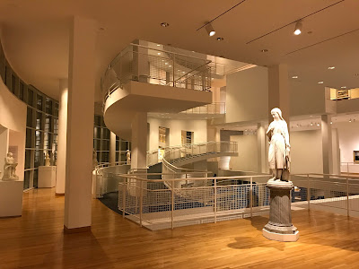
I was recently in Atlanta, Georgia and had the chance to swing by one of my favorite sketching locations - the High Museum of Art. The building, designed by architect Richard Meier and opened in 1983, is itself a sculptural work of art:


The High Museum, part of the Woodruff Arts Center, houses a splendid collection of European and American sculptures from the late 19th Century.

My first subject is a bust of the French writer Honoré de Balzac (1799-1850) - one of the founders of Realism in French literature. The bust was sculpted by Pierre-Eugène-Emile Hébert (1823-1893) in 1877:


I enjoy sketching sculptures executed in the French Academic style, because the composition of shapes, lines and proportions is typically very carefully thought out and composed. There is typically a large skeleton of proportions that is then subdivided again and again to arrive at the details. When I sketch from such a sculpture, I try to proceed step-by-step in the same manner.

I prefer to do these types of proportional studies using just a pencil and paper and I don't typically even worry about using an eraser - just leaving my guidelines visible as I go. I avoid other tools and measuring devices so I can focus on training my eye and hand to see and record proportions and shapes as accurately as possible.

First I try to capture the big shapes and proportions as accurately as possible:


Then I begin to subdivide to capture the next level of detail. I concentrate on finding the shapes of the outlines of both the forms and the shadows:


I proceed across the entire drawing briskly but methodically, trying to make sure each line is properly located in reference to the others:


Working in this manner, a likeness of the sculpture begins to emerge:


For this type of proportional study, I do only minimal modeling of the various tones within the shadows, and instead focus primarily on the precise perimeter shapes of the shadows:


I constantly look back and forth from my sketch to the sculpture being drawn in order to compare the shapes, angles and proportions.

This is wonderful exercise for both the eye and my sense of proportion. I did this sketch exercise in about 45 minutes, and I like to move pretty quickly so I can do more than one sketch in a museum visit when possible:


I had the opportunity to do 2 more sketches in a similar manner on this visit to the High Museum.

Next was a sketch of Flora by the American sculptor Chauncey Bradley Ives (1810-1894):


And then a sketch of Proserpine by one of my very favorite American sculptors, Hiram Powers (1805-1873):


Friday, January 27, 2017

"The Sense of Proportion is the Chief Artistic Sense"

Proportional study sketches from master drawings, paintings and built works of architecture are some of the best possible exercises for one's sense of proportion.  I try to do them whenever I can.  
Simple tools - just a pencil and sketchbook are all that is needed.  Here are some examples from my travels:

Proportional study sketch by James Dougherty from the painting Portrait of a Young Man – by Hans Holbein the Younger in the National Gallery of Art, Washington DC


Julien Guadet (1834-1908), the esteemed French architect, theoretician and Professor at the École des Beaux-Arts, Paris writes in his four volume masterwork Éléments et Théorie de l'Architecture:

"The sense of proportion is the chief artistic sense.  Proportions are infinite and delicate in art and are still more so in nature.  

How do you recognize a friend among all the people you see, even though you see millions pass?  A question of proportions alone.  But proportions are so infinite and variable, that among millions of heads no two are exactly alike.  

Nothing develops a sense of proportion like practice in drawing.  To draw is to perceive and then express those specific proportions that distinguish and identify the model.  The best draftsman is the most sensitive to proportions."


Proportional study sketch by James Dougherty from the sculpture Theseus Battling the Centaur - by Antoine-Louis Barye in the High Museum of Art, Atlanta GA


Proportional plein air study sketch by James Dougherty of Budapest's Chain Bridge - designed by William Tierney Clark


Proportional study sketch by James Dougherty from the sculpture Nymph of the Fields - by Carlo Pittaluga in the National Gallery of Art, Washington DC

Amazon: Éléments et Théorie de l'Architecture