Friday, September 20, 2019

Historic Central European Cities and Towns: Beauty + Superior Environmental Performance

As towns and cities grow, the pattern chosen for new urban development has a large impact on environmental footprint.

Over the past few years living in Central Europe, I’ve been fortunate to explore the historic cities and towns here in Hungary a good bit with my family. We’ve discovered that there are a number of really spectacular gems of urbanism and architecture worth study. 


Pécs, Hungary


Szeged, Hungary


Eger, Hungary


These places offer valuable lessons on how to build cities and towns that are not only charming and beautiful - but simultaneously provide superior environmental performance.  

Here's a brief video explaining reasons why the designs of these historic cities and towns often perform so well environmentally, compared to contemporary suburban patterns:


Though many of these places started as Roman or medieval settlements, most of them were greatly expanded and embellished relatively recently during Hungary’s equivalent of the Belle Époque in the late 1800s when Austria-Hungary experienced a prolonged period of prosperity. 

Below are Google Maps view links to some of our favorites places to visit. 

Note: When you click on a link to explore an example in Google Maps, I recommend looking at the urban pattern from above, and also using the "Street View" function to drop down and explore the beautiful character of the streets and spaces from the ground.


1. Budapest: [Click to Explore in Google Maps]

Budapest set the tone for architecture and urbanism in Hungary during the late 1800s.  It’s grander in scale (4 to 6 stories tall) than the smaller cities and towns (usually 1 to 4 stories tall), but there are otherwise many similarities in the design language.  The most common building type is a mixed-use, attached type that features a central courtyard with open galleries at each floor level.  This building type facilitates a very efficient use of the land in a very pleasant low-rise format.

The architectural design of the façades usually reinforces the legibility of the urban structure while also giving each (otherwise relatively similar) building a unique and often very beautiful individual expression.


Next is a selection of smaller Hungarian cities and towns. I think the physical design of Hungary’s smaller cities and towns provides really wonderful design inspiration, and there are many examples of efficient use of mid-block areas frequently employing mid-block passages, or mews, of various configurations.  


I hope you find this brief tour helpful and enjoyable!


Monday, May 28, 2018

Architectural Design Techniques of Urban Buildings in the Late 19th and Early 20th Century


I'm very excited to present a new paper I've written titled:

Architectural Design Techniques of Urban Buildings in the Late 19th and Early 20th Century

This illustrated essay explores specific physical design techniques employed by architects during this golden period of city-building to achieve their remarkable results.

It has just been published by Periodica Polytechnica Architecture (a peer reviewed scientific journal published by the Faculty of Architecture of the Budapest University of Technology and Economics).


https://pp.bme.hu/ar/article/view/11830/8025

Urban buildings constructed in historic city centers of Europe and America in the late 19th and early 20th Century demonstrate a remarkable consistency of architectural excellence and harmony which can be observed from the large urban forms down to minute details. 

https://pp.bme.hu/ar/article/view/11830/8025

The comprehensive system of design principles employed by architects of the time in the creation of these buildings has resulted in urban environments that achieve a very high degree of functionality as well as adaptability to the evolving needs of their modern populations.

(Note: For those who are interested in delving even deeper, Section 3 of the essay focuses on the rediscovery of lost classic architectural design instructional texts and contains a recommended reading list). 

Tuesday, March 13, 2018

Towncrafting Workout 02 - Watercolor Elm Tree

Would you like to improve the landscape elements in your illustrations? Join me for this quick "how-to" workout to practice a step-by-step process for painting an elm tree in watercolor!

Watercolor is a great medium for quickly capturing accurate form, evocative color and lighting effects.  Grab your painting materials and let’s get started!


MATERIALS:
You'll need a few simple supplies to follow along with me. Here's a materials list (along with links if you'd like to buy them online).


Paper:

Cold press means the paper has a medium texture - not too smooth and not too rough. 90lb is a fairly thin watercolor paper. I use it because it will go through a photocopier, which is often useful if I need to quickly transfer a line drawing onto my paper before painting. (In this exercise we’ll be blocking out our drawing directly on the paper though, so a thicker paper like 140lb would work great too).


Paints:

I’m using Windsor and Newton professional artists colors. For this painting I’m using a fairly limited palette of just 6 colors.  The first three are primary colors (yellow, red and blue) that mix well together.  The last three colors are extras that are useful for occasionally accenting and/or darkening mixtures as needed. 

  1. Yellow Ochre - a warm, earthy yellow.
  2. Permanent Alizarin Crimson - a slightly purplish red. 
  3. French Ultramarine - a deep, intense blue.
  4. Permanent Sap Green - a strong, slightly olive green.
  5. Antwerp Blue - a bright, smooth blue that goes down with a minimum of graininess.
  6. Neutral Tint - a beautiful grey that mixes well with all the other colors to reduce the value and saturation of a mixture when I want to achieve a really dark color.
I like to use tube colors because they make it easy to mix up a large enough quantity of paint for my bigger wet-on-wet washes.  (You could do this painting workout with dry pan watercolors too, but you'll just need to spend a bit more time mixing up your paints).

You can buy the watercolors in individual tubes (the small 5ml ones last a long time - the colors I've highlighted are the individual tube colors I could find available online at Amazon), or Windsor and Newton makes a great set available for purchase online with all these colors or pretty close equivalents that should work just fine:


Brush:

A high quality watercolor brush is critical. A good brush will hold a substantial amount of paint which allows you to block in shapes quickly and will also come to a sharp point when it’s wet to allow you to paint small details. For this painting, I’m using just a single round” shaped sable watercolor brush by Princeton. The size I’m using is a #12.


Watercolor Mixing Palette:

I like to use a palette with separate small wells on the left for squeezing out a pea-sized bit of paint straight from each of my tubes (a little bit goes a long way).  My palette also has larger wells on the right.  I put a tiny splash of water in each of the larger wells and use them to mix the colors to be used in the actual washes on my painting.

I'm using a small plastic palette in the video.  I also like to use this slightly larger plastic watercolor mixing palette made by Jack Richeson.


Water Cup:

You’ll need a container to hold water for mixing your paints and cleaning your brushes.  (Be sure to use a container that you won't be drinking from - some watercolor paints can contain ingredients that are toxic to ingest).


Paper Towels:

These are useful for dabbing off extra paint from the brush if you’ve picked up more than you intended (and also great for cleaning up)! Any brand will do.


BOOK:

The book I'm referencing in this workout is:
How to Draw Trees (by Frank M. Rines)

This brief, wonderfully condensed book discusses key form and compositional aspects of many species of trees from an artistic viewpoint. 

It also breaks down a great sequence for rendering trees from the initial block-in, through more detailed attention to silhouettes, to planning of shades and shadows, and then steps for finalizing the illustration.

It's a great resource for any artist interested in capturing the specific character of various species of trees.


Tuesday, February 13, 2018

Towncrafting Workout 01 - Classic Architectural Composition

Want to improve your architectural composition skills? Join me for this quick "how-to" drawing workout! 

We'll get our pens moving and practice how to break a complex classic architectural composition down into bite-sized steps:


Base Drawing:
Download the base drawing that I'm working from here (click the image and then save it). Print the image at 11"x17" or A3 size.


Materials:
You'll need a few simple materials to follow along with me. Here's a materials list (along with links if you'd like to buy them online).

  1. Tracing paper: I prefer tracing paper with a high degree of transparency for an exercise like this, like the A3 Tracing Paper by Derwent.
  2. Pencil: any normal writing or drawing pencil will work for this exercise. I'm using a #2 (HB) pencil by Dixon Ticonderoga.  
  3. Pen: a felt or fiber tip pen is best when working on tracing paper to reduce the chance of smearing. I'm using a Black Sharpie Ultra Fine Point.
  4. Drawing triangle: any drawing triangle will work for this exercise. For example, the simple Alvin set containing both 30-60 and 45 degree triangles.
  5. Parallel bar: you can get by without a parallel bar for this exercise, but I find it helpful to keep things orthogonal when I'm drawing quickly. I'm using a Faber-Castell A3 size lightweight TK System drawing board with parallel bar.


Les Concours Publics d'Architecture:
The base drawing I'm working on top of is from a magnificent 16 volume set titled Les Concours  Publics d'Architecture.  It's a French publication produced at the turn of the last century that compiled the submission drawings of numerous public professional architectural design competitions. The book set is a treasure trove of original 19th Century and early 20th Century architectural drawings - one of the best collections I've ever seen - and well worth the effort to see in person. I particularly like that it includes not only civic buildings, but also a wide variety of beautifully designed fabric buildings.

Here's a link to the HathiTrust listing for the complete set of Les Concours Publics d'Architecture.

HathiTrust's copies of Les Concours  Publics d'Architecture are scans from a complete set of the books located at the University of Michigan.

HathiTrust used to permit a full online viewing of pdfs of the books, but now unfortunately seems to allow only limited online viewing of search terms. But - to find a library near you with actual print copies, just click on their "Locate a Print Version: Find in a Library" tab. You can enter your address / zip code and it will give you a list of the nearest libraries with a copy in their collection.

(Incidentally, this is not the same publication as the Les Concours d'Architecture de l'Année Scolaire series, which is also a fantastic resource. Les Concours d'Architecture de l'Année Scolaire is an annual publication compiling architectural drawings produced by students at the École Nationale Supérieure des Beaux-Arts in Paris from the turn of the last century).

Here's a link to the HathiTrust listing for the Les Concours d'Architecture de l'Année Scolaire

Tuesday, November 7, 2017

Connecting Passengers To Their Train Platform Seamlessly: Vienna's Hauptbahnhof Station

This past weekend, I visited Vienna with my wife and kids. We traveled by train and arrived at the new Hauptbahnhof train station (image from Wikipedia):

The sleek, bustling new central station, conveniently surrounded by a cluster of new transit oriented development, consolidates boarding to international trains traveling north, south east and west from the city. It also connects directly to Vienna's metro, streetcar, bus, bikeway and pedestrian systems:


One of the details that I was particularly impressed with was the well-thought-out access for passengers to the station's 6 train platforms that run parallel to one another.

Typically in such arrangements, there is a lower pedestrian access passageway that links the platforms; but often this passageway can be dark, unattractive and occasionally unsafe-feeling if there is a lack of natural surveillance.

The designers of Vienna's Hauptbahnhof train station solved this issue by converting the lower passageway into a bright, airy multi-level shopping hall. Stores and cafes line the sides, making the space feel lively while providing travelers with useful goods and services and a great diversion to pass the time while waiting for one's train departure time.


Running down the center of the shopping hall are a series of glass elevators and escalators marked with the numbers of the various train platforms. When it is time to board a train, one need only go up a level, and then walk out right onto the platform:


This seamless connection for passengers to the train platform is a wonderful innovation that helps keep every step of travel by train to Vienna a high quality experience:


The Vienna Hauptbahnhof train station's website has a cool 3D image tour of the construction process. (click here to take the tour)

Tuesday, October 31, 2017

Halloween in Budapest - Jack-O-Lantern Festival in Heroes' Square

In celebration of Halloween, today's post looks at seasonal festivities in some of Budapest's well designed public spaces. 


Halloween has only recently begun to be celebrated in Budapest. My wife and I had a great time this year dressing up our kids in costumes and enjoying the festivities like trick-or-treating on Raday Utca - one of the city's beautiful restaurant-lined streets.


We ended our evening at Budapest's Heroes' Square - one of the city's main signature public spaces - which is grandly flanked by porticoed museums and terminates a marvelous multi-way boulevard.


The square is used throughout the year for a variety of concerts, shows and other events. I wrote a while back about how Heroes' Square is closed to traffic and transformed into a horse track for the annual Nemzeti Vagta (National Gallop) celebration:


Well, for Halloween, Heroes' Square is the site of a wonderful, spontaneously-organized Jack-O-Lantern Festival.


Many people have recently begun carving Halloween pumpkins with their children, and wanted a place to share their creations. Heroes' Square, as one of the public 'living rooms' for the city, seemed like just the place.

Today, hundreds of people show up at Halloween and place their lighted Jack-O-Lanterns on the pedestals of the various Belle Époque monuments. Crowds slowly circulate to marvel at the display, take photographs and discuss their favorites.


A great ending to a great day celebrating Halloween in Budapest!

Wednesday, April 19, 2017

Sketching Sculptures at the High Museum of Art

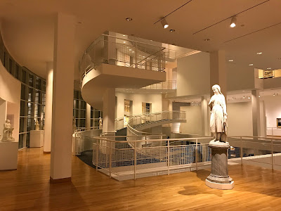
I was recently in Atlanta, Georgia and had the chance to swing by one of my favorite sketching locations - the High Museum of Art. The building, designed by architect Richard Meier and opened in 1983, is itself a sculptural work of art:


The High Museum, part of the Woodruff Arts Center, houses a splendid collection of European and American sculptures from the late 19th Century.

My first subject is a bust of the French writer Honoré de Balzac (1799-1850) - one of the founders of Realism in French literature. The bust was sculpted by Pierre-Eugène-Emile Hébert (1823-1893) in 1877:


I enjoy sketching sculptures executed in the French Academic style, because the composition of shapes, lines and proportions is typically very carefully thought out and composed. There is typically a large skeleton of proportions that is then subdivided again and again to arrive at the details. When I sketch from such a sculpture, I try to proceed step-by-step in the same manner.

I prefer to do these types of proportional studies using just a pencil and paper and I don't typically even worry about using an eraser - just leaving my guidelines visible as I go. I avoid other tools and measuring devices so I can focus on training my eye and hand to see and record proportions and shapes as accurately as possible.

First I try to capture the big shapes and proportions as accurately as possible:


Then I begin to subdivide to capture the next level of detail. I concentrate on finding the shapes of the outlines of both the forms and the shadows:


I proceed across the entire drawing briskly but methodically, trying to make sure each line is properly located in reference to the others:


Working in this manner, a likeness of the sculpture begins to emerge:


For this type of proportional study, I do only minimal modeling of the various tones within the shadows, and instead focus primarily on the precise perimeter shapes of the shadows:


I constantly look back and forth from my sketch to the sculpture being drawn in order to compare the shapes, angles and proportions.

This is wonderful exercise for both the eye and my sense of proportion. I did this sketch exercise in about 45 minutes, and I like to move pretty quickly so I can do more than one sketch in a museum visit when possible:


I had the opportunity to do 2 more sketches in a similar manner on this visit to the High Museum.

Next was a sketch of Flora by the American sculptor Chauncey Bradley Ives (1810-1894):


And then a sketch of Proserpine by one of my very favorite American sculptors, Hiram Powers (1805-1873):